A Perfect Indicator?
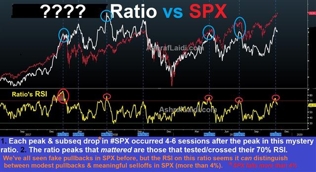
Those who have shorted equity indices over the past 3 weeks (like I have) were simply wrong. In each of the trades, I found some "interesting" technical/sector signals that seemed to have been flashing the "sell" signal. But none of those proved correct. Even as I was only expecting a 2%-3% drop--that just did not happen. So what does this chart below tell us? Is it perfect in calling SPX declines?

The mystery instrument (white) is a ratio, which acted as a flawless leading signal for declines in the SPX (S&P500 or US500). Note that each time the ratio tested/crossed its 70% RSI, the SPX fell by at least 5%. More importantly, the peak and subsequent selloff in the ratio occured 4-6 trading sessions prior to the fall in the SPX. I will investigate this one closely this week, before deciding whether to pull the trigger on the SPX or other indices. You will recall that each of the last mystery charts, tuned into successfully completed trades (here, here and here). If you guessed the ratio, please notify me.
More Hot-Charts
-
USDJPY and EURUSD
Apr 22, 2026 11:57 | by Ashraf Laidiسأرسل رسالة صوتية و كتابية توضيحية لأعضاء مجموعة الواتساب الخاصة حول هذه المخططات - Will send detailed note on latest parameters to our WhatsApp Bdcst Group... -
US crude oil Update
Apr 17, 2026 16:02 | by Ashraf Laidiسأرسل رسالة صوتية و كتابية توضيحية لأعضاء مجموعة الواتساب الخاصة حول هذه المخططات - Will send detailed note on latest parameters to our WhatsApp Bdcst Group... -
Patterns on Fridays & Mondays
Mar 30, 2026 14:38 | by Ashraf LaidiSince the start of the war on Iran, the pattern of falling Fridays in US equity indices has become obvious. Will the pattern ends this week.


